What is Mobile First Design? And Why Is It Important For Your Business?

The internet is a mobile- first world now, and your website needs to embrace this shift to avoid missing out on opportunities. By prioritizing your mobile experience with user friendly design principles and an always on-the-go approach to content, you can reap bigger rewards from referral channels and compete more effectively for visibility.
There’s no understating just how much of an impact smartphone devices have had upon the online landscape. Seventy-seven percent of U.S. adults (≈250 million) now own a smartphone , according to Pew Research, and only 17 percent of people own a cell phone but not a smartphone. Even more interesting, there are 6.5 million more smartphone owners than desktop/laptop owners, and 65 million people depend entirely on their smartphones for internet access.
The shift from large, stationary computers to pocket-sized touchscreens has had a huge impact on not just website design but also how online content is consumed in general. Understanding just how much the mobile first mindset has affected the website design process can help your business learn how to build a better website that’s aware of mobile’s center stage presence in our modern tech culture.
What Does Mobile First Design Mean?
The term “mobile first” may sound like a buzzword or industry jargon, but it’s actually quite descriptive despite its simplistic name. People use the term “mobile first” because it instantly separates their design philosophy from older, non-ideal approaches to mobile website design and optimization.
To explain the differences in design philosophy, let’s start with a history lesson. Our journey through time begins in the late 1990s, when pocket-sized devices like organizers and cell phones first began to have internet connectivity.
The thing about the internet back then was that it could be janky and unreliable. People were still figuring out how to make it work properly across a range of computers and connection types. Few people had home access to a reliable and relatively speedy internet connection.
As you might imagine, cell phones at the time endured this struggle a hundredfold. Their processors were weak, display resolutions were minimal and you could never count on a sustained connection.
To compensate, web designers would build two versions of a website. One version would be the fully-featured design intended to run on a standard desktop or laptop computer. Then, a mobile website team would strip down this design as much as possible to its barest components . That version would be loaded when a mobile signal was detected.
At first, most early mobile internet adopters would be forced to navigate to a different URL with an “m.___” added to the domain, such as “m.yourbusinesssite.com” instead of the normal “yourbusinesssite.com” they would find when searching from a desktop computer.
Then, developers and devices advanced so that the exact same URL could load different content for mobile versus desktop/laptop users. This approach was called “dynamic serving.”
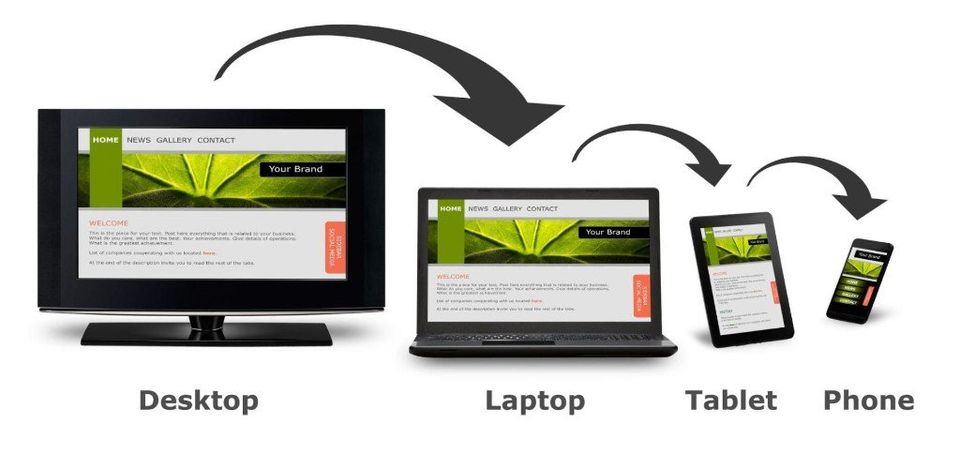
Now, most developers have moved onto “responsive design,” which uses the same HTML code for all users. Instead of serving up a few different tiers of content, all content scales automatically. That way, people with different device screen sizes can automatically have the best usability.
During the transition from separate URLs to dynamic serving to responsive design, overall mobile internet use surpassed desktop laptop traffic . In response, designers and developers stopped treating mobile websites as an afterthought or something that is built off of a secondary version of their site. Instead, they considered mobile first, and their designs for larger screens were advanced off of those basic blueprints.
“Progressive Advancement” Versus “Graceful Degradation”

Another way to conceptualize the difference between “mobile first” as opposed to “mobile sometime later” is through the above two terms.
“Graceful degradation” was the old standard operating mode for designers. Their desktop/laptop website was the development priority, and it’s what most of their resources went towards. Then, once most or all of the desktop-focused design was complete, a team would try to scale down the website’s size and complexity while sacrificing as little of the original experience as possible.
In other words: they degraded the original design as gracefully as they could. Compromise was inevitable, and many website visitors could feel like they were being served a second tier experience.
“Progressive advancement,” on the other hand, refers to that approach in reverse. The design team comes up with the perfect set of design principles and layout ideas built around a small screen. This design is optimized so that mobile phone users across a broad range of screen sizes and processing powers could still have an amazing experience. Then, a desktop/laptop team would consider how to expand that core design and take advantage of larger screens, more precise navigation (aka non-touchscreen controls) and heftier processing power.
Mobile users get two main benefits out of progressive advancement:
- The website was built from the ground up to look great and be usable on mobile
- They never feel as if they are having to make sacrifices to view a website on their mobile device; the larger site version just adds bells and whistles
A further consequence of progressive advancement is that most of the creativity and effort behind a website goes into the mobile experience. Instead of thinking, “how do we change this menu so that people without a mouse pointer can actually use the darn thing?” the team says, “what would a menu perfect for touchscreen controls look like?”
The consequences of such a mindset switch are huge, and they can have a direct impact on your bottom line.
How a Mobile First Website Approach Benefits Your Business

We’ve talked at length about how the mobile first approach evolved over time and how it makes life better for the average smartphone user. But what about how these changes bring your business more opportunities and more money?
Here are a few of the biggest benefits you’ll notice when you make the switch:
1. Better Search Engine Ranking and Visibility
In April of 2015, Google decided to finally put their foot down regarding websites that ignored the needs of mobile users. From that point on, websites that met their mobile-friendly design guidelines would get a ranking boost for all mobile searches.
The change effectively punished sites that weren’t able to keep up with their expectations. There wasn’t a huge penalty , but the difference was enough to create a gap that potentially lead to lost leads and revenue.
Furthermore, since behavior signals like click-through rate and overall traffic can help or hurt your rank , building a solid experience gives you a competitive SEO advantage.
2. Improved Website Experience Leads to More Customer Conversions
People don’t want to give their money to businesses that make it difficult or impossible to access their website via mobile. According to one Google study, 61 percent of people who have trouble accessing a mobile website leave and never return . Forty percent of these lost lead opportunities will then visit a competitor’s website instead.
Ignoring the needs or convenience of mobile users can therefore literally drive customers away from your sales funnel and into your competitor’s arms.
3. A Mobile First Approach to Design and Content Now Means a Softer Learning Curve
Make no mistake: mobile audiences are the dominant driving force behind all online innovation and evolution. Data usage and website visits across the entire internet have gone up—both per-person and overall. Yet, traffic from tablets and desktop/laptop devices has declined .
This scenario tells you that smartphones are the main driving force behind growing online use. Our obsession with social media and browsing on-the-go is changing the way we approach the internet as a whole.
● Locally-focused content is getting a boost because people are searching for business options while already en route.
●People are consuming more video because it’s easier to view on small screens than text, leading to a huge spurt in mobile video advertising .
●Content, in general, has moved towards shorter paragraphs and more prominent visuals because blocks of text look ugly and are hard to parse on a mobile screen.
All of these changes are important now and will only become more important in years to come. If your business keeps kicking the can down the road, you could quickly find that your strategies are hopelessly dated, leading fewer opportunities and lower conversion rates.
Make the switch now. Start thinking “mobile first” with everything you do, because smartphones are no longer the sideshow; they’re the main event.
Are you looking for help navigating the ever complicated digital marketing space? We can help!
The Harvest